Private penthouse/office
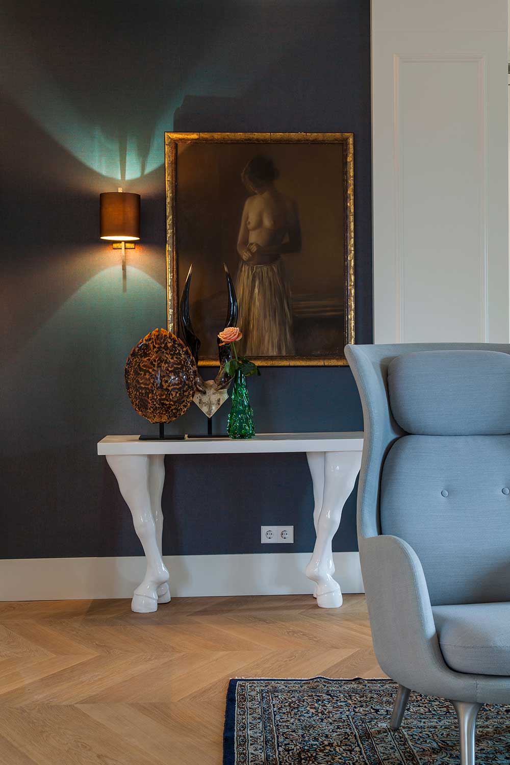
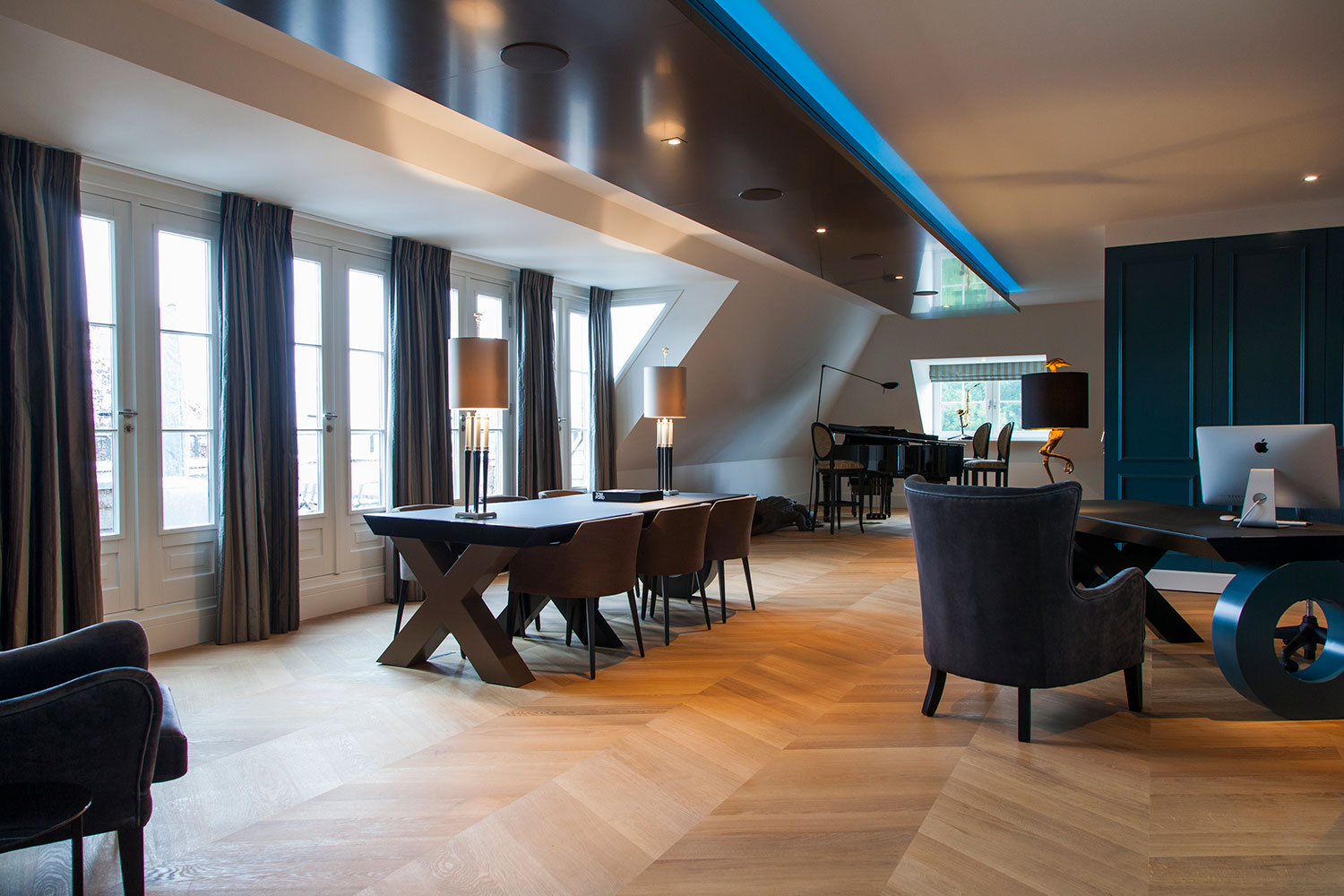
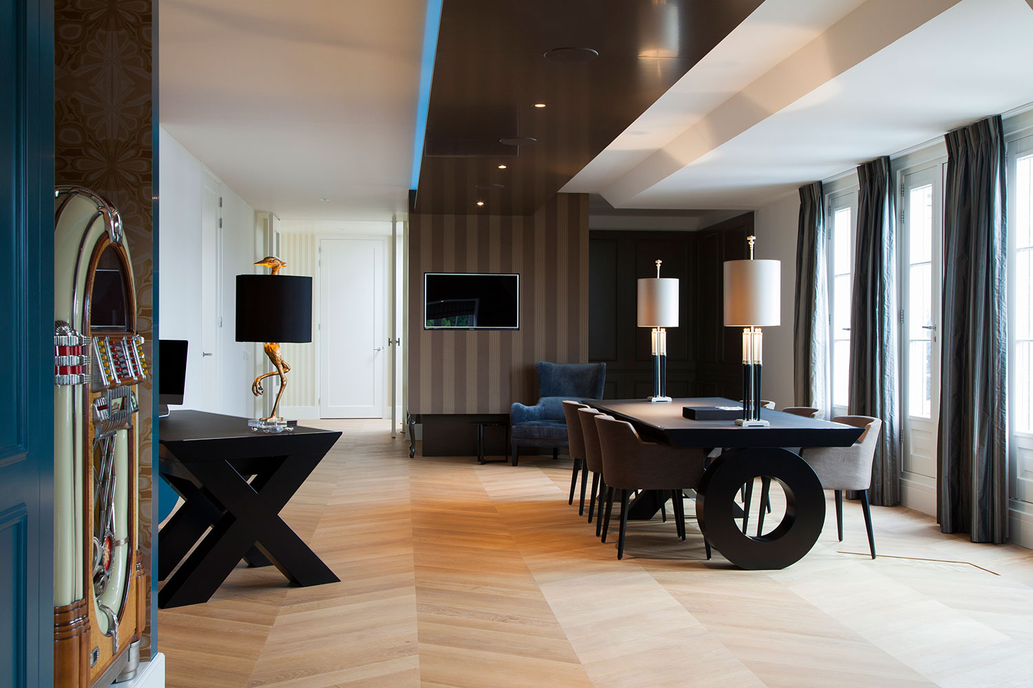
The penthouse is divided into two areas: left is the home office and the guestrooms, on the right there is the living room, master bed room, the bathroom and the study. By using two color schemes - stark colors like brown, petrol, vibrant red and blue - against natural tones combined with fased colors, the apartment is balanced
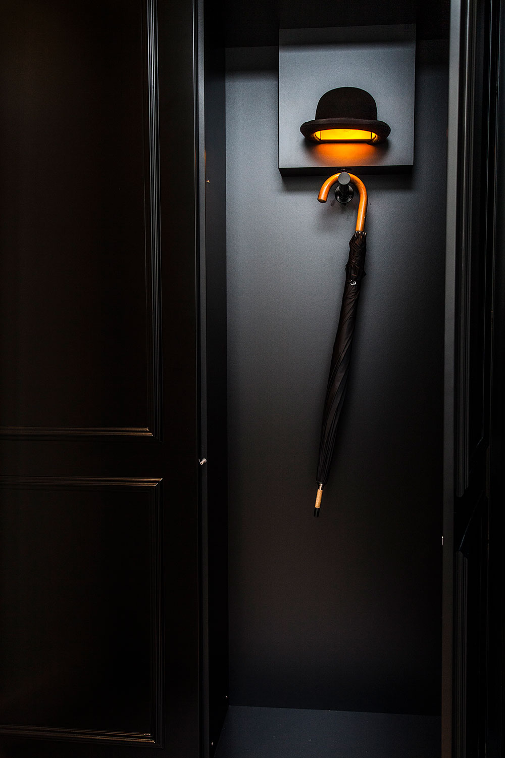
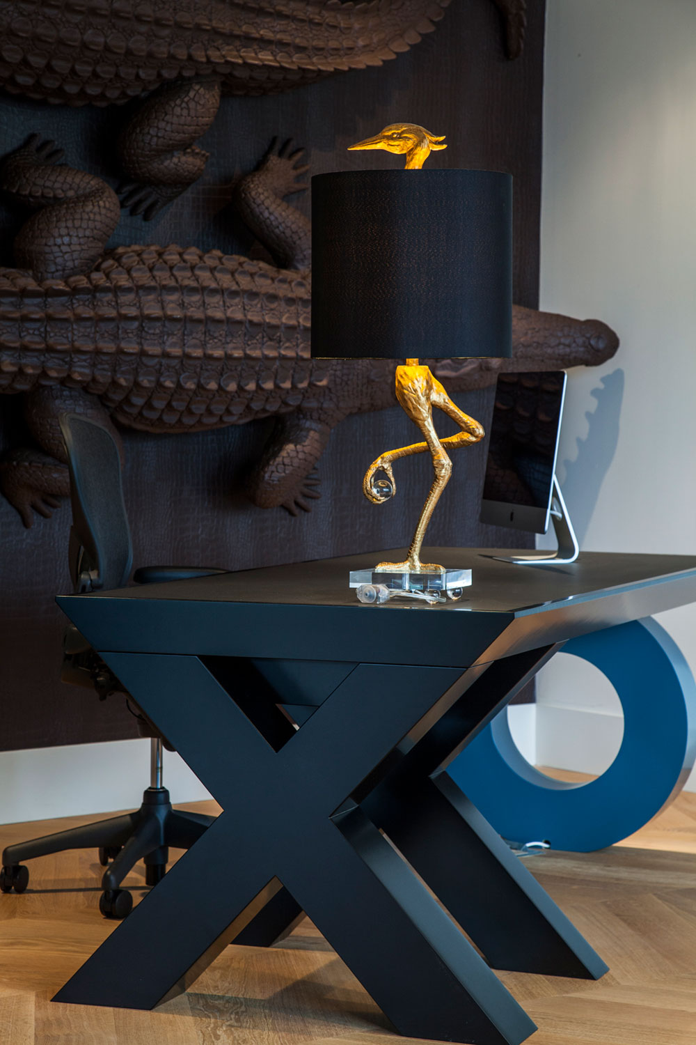
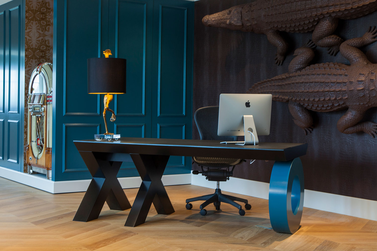
In the Office, paneling is used to create a classical atmosphere, with the umbrella and bowler in the wardrobe along with the grand piano, the atmosphere is more like a Gentlemans Club. All furniture such as the conference table and desk are designed by vanbrusselccp.
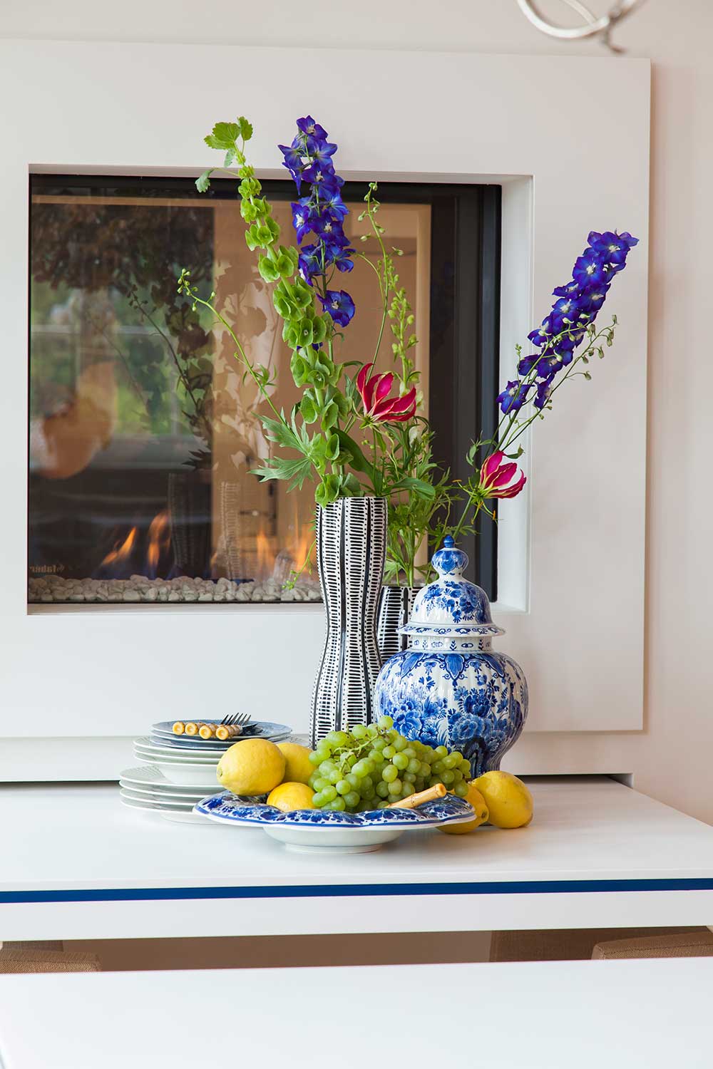
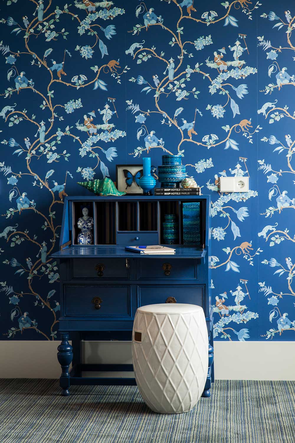
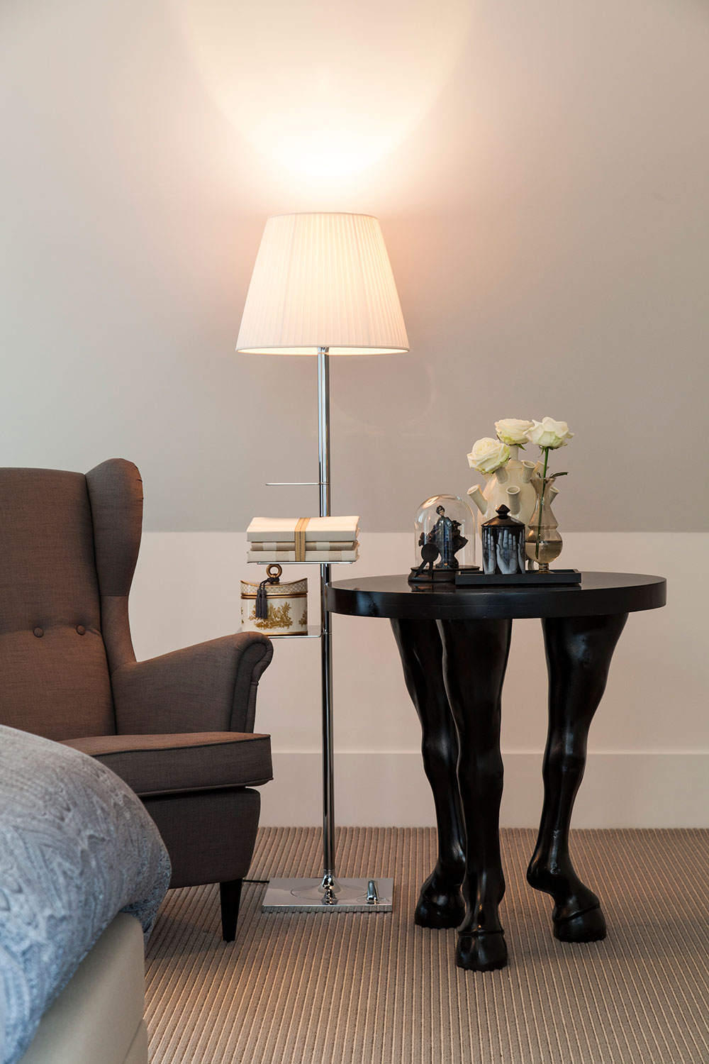
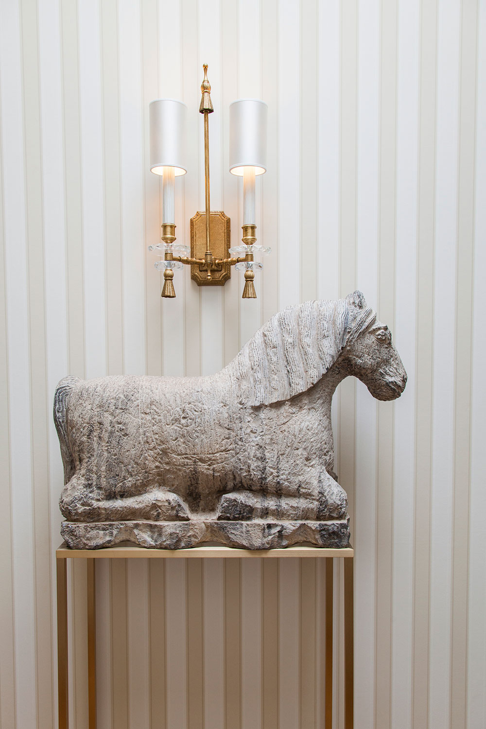
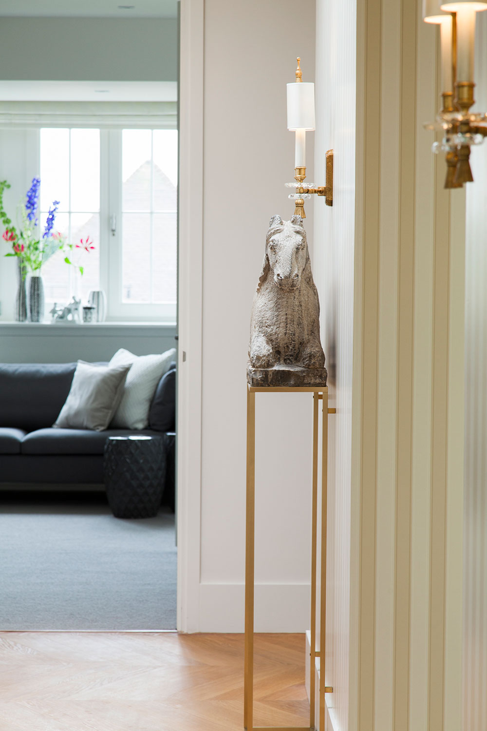
The guestrooms are more outspoken, using striped carpets and patterned wallpaper. The hallway, connecting the wings of the apartment are in soft tones, walls and ceiling are wallpapered in a classical small stripe. In the dining area the long table, designed by vanbrusselccp, is situated against the fire place, divided in two parts so that the table can be used as a table for two or as table for twelve persons. In the living area soft tones with pale blue and green blend in with the view.
The kitchen area is total in white with two strong colored elements, the orange cabinet popping out from the wall and the wall to ceiling visual with bright colors.
INTERIOR design vanbrusselccp
INTERIOR customization Rick Smeenk bv
INTERIOR photography Rachel Dubbe
vanbrusselccp 2013

